
This is my third part on how to build themes for WordPress 6. In this case today it’s not only about themes, but also getting certain things working in WordPress 6 that are more tricky to handle in general.
If you followed along my hustles in the last part, be prepared for even more hustle this time. As for all systems – the more you want custom parts, the trickier it will get. So, I assume many of the practices I present here are not best practice, but a working solution.
Looking at my last to-do list, we still need to fix some stuff:
- Modify the look of the front-page
- Modify the look of other pages
- Find a solution to integrate p5.js
- Finetuning of sites (articles)
- Find a solution to make the variable fonts behave in a variable way
- Get Indieweb Support to get going
Regarding my to-do list, I would say, we do some fixings on the article page first and then modify the homepage, as we have most tricky elements in place. Regarding my indieweb support, I guess I give it some time till I am willing enough to work on it.
Finetuning of article page (get variable fonts going)
To get started with my part 3, I start with some lower hanging fruit. Some finetuning on the article page.
On the left, you see a screenshot of my original, elementor built and on the right my status on the rebuilt in WordPress 6 natively:


So, we still have some variations in the header we could fix later:
- Full-width vs. boxed
- Font-size and spacings (Alignments)
And we have some variations in terms of the article page itself:
- The most obvious one: the font variations settings are not applied (in fact it is the same font type, but the original version uses settings to soften the font; see some more variations on the fraunces homepage if you are not familiar with variable fonts)
- Slight difference in font size and line-height
- Behaviors of site elements are different (due to application of indieweb settings in the background) and missing styles
- A Black line is missing as a separator
- The excerpt of the post is not being displayed
- Overall typo layout
To get started, we use the Front Site Editor to check the structure of the document. To edit the post layout, click on edit site and select the post template (called “Single Post”):

If you didn’t follow my other steps, you might wonder, why in the header there’s an element saying, “attempt block recovery”, this is related to an animated SVG as Logo. The Editor can’t display the element.
For now, we focus on the content area and the document structure. After adding some elements, we have the right structure:

My main interest is the structure in the editor. The second part, the detailed styling could be done in the theme.json (I believe the first address to look for, though I don’t like it) or the style.css (for all the things, the JSON didn’t like or stuff that got overwritten).
In the JSON file I add some more settings:
"core/post-title": {
				"elements": {
					"link": {
						"color": {
							"text": "var(--wp--preset--color--primary)"
						},
						"typography": {
							"textDecoration": "none"
						}
					}
				}
			},
			"core/post-excerpt": {
				"typography": {
					"fontSize": "var(--wp--preset--font-size--large)",
					"fontWeight": "300"
				}
			}
And finally, I open the beloved style sheet again to try to smoothen my font.
Finally, this is the place to modify those settings. As a sidenote. Being lazy, I just copied the complete style attributes from the one page to the other (including font-sizes). It’s interesting, as those get overwritten by the settings in the JSON again. Something that is good to know to avoid some later extensive use of “!important” statements which mess up everything.

In the CSS file, you could add the smoothing settings to get it going (at that moment, i didn’t check, if there might be browser issues in other than chrome on mac OS):
h1 {
	--wght: 800;
	--SOFT:100;
	font-variation-settings: 'wght' 800, 'SOFT' 100;
}
Speaking about cross-browser testing and handling CSS, there used to be a lot of pain. Especially in the areas known as browser war. Optimizing for Netscape and all the early internet explorers was pure pain. Today, with a disappearing Internet Explorer 11 and all related pain, we mainly face strange browser topics (especially if you use a newer technology stack with CSS Grid or Web GL)… but honestly it feels like peanuts compared to the old times.
Now, in 2022, I would finally say, it feels so good to be able to modify styles in CSS (as a new enemy with JSON appeared – sorry, dear JSON we are not friends for styling yet… for structuring information I like you, but not for styling!).
Before I move on, let’s quickly export our theme again and place our newly created single post in the theme folder.
Finetuning of homepage
Opening the homepage, one might wonder, why the headline isn’t smoothened as well yet. This relates to the semantic structure of the page. The bigger headline being used here is a h2 and I didn’t assign the smoothing settings yet. (Also, to all designers and Content Administrators… h1-h6 doesn’t relate to styling at first! It’s about semantics and sometimes another semantic structure is better! – Please, don’t choose Headline because of their visual style, choose them because of their semantic correctness!
To Add the font smoothing, we simply add h2 after the h1.
To edit the homepage, we created a dedicated front-page template for it. To assign styles, there’s a direct option to use the “home” class that is being used for the front-page template, or you could assign classes to each element, that needs some tweaking. To keep an overview (for now), I quickly work with assigning styles to the single elements.
Feeling more home in CSS I could quickly add some classes:
.mf-mid {
    font-weight: 600;
    font-variation-settings: 'wght' 600, 'slnt' 0;
}
.intro {
    font-size:var(--wp--preset--font-size--small);
    text-align: center;
}
.intro-head {
    margin:0;
    padding: 0;
    text-align: center;
}
.winke {
    animation-name: wave-animation;
    animation-duration: 2.5s;
    animation-iteration-count: 3;
    transform-origin: 70% 70%;
    display: inline-block;
}
@keyframes wave-animation {
    0% { transform: rotate( 0.0deg) }
   10% { transform: rotate(14.0deg) }
   20% { transform: rotate(-8.0deg) }
   30% { transform: rotate(14.0deg) }
   40% { transform: rotate(-4.0deg) }
   50% { transform: rotate(10.0deg) }
   60% { transform: rotate( 0.0deg) }
  100% { transform: rotate( 0.0deg) }
}
So now even my hand is waving:


The vertical alignment of the objects isn’t good. There’s some margin-bottom to each element, we need to get rid of the additional spacing. To keep it fast, we go directly for the CSS and see if it applies; yes, it does:
.home .wp-block-columns {
    margin-bottom: 0;
}
Depending on your preference of the separation of code and layout… this was the reason why there is html, CSS and no more table layouts, you could decide for yourself, if you want style elements in the editor or mainly via code. In my case, some styles are assigned to the elements. To get rid of an applied style, click on the three dots near the style attributes and reset the values.

As my front-page is a unique site, i would recommend styling only the elements visible at that site in the editor or follow some clear separation. In general, it is recommended to style on one place.
Following the straightforward path in CSS, we could continue styling our elements:
.home .wp-block-post-title a {
    font-variation-settings: 'wght' 600;
    color: black !important;
}
.home .wp-block-post-title a:hover {
	font-variation-settings: 'wght' 700, 'slnt' 0;
	transition: all .3s;
	text-decoration:none;
}
.home .wp-block-post-title a:before {
    content: '';
    display: block;
    height: 12px;
    position: relative;
    right: 1px;
    top: 42px;
    width: 65%;
    z-index: -1;
    transition: all .3s ease;
	background-color: var(--wp--preset--color--secondary);
}
.home .wp-block-post-title a:hover::before {
	width: 101%;
}
.home .wp-block-columns h4 {
    padding: 6px 0 24px 0;
    margin: 0;
}
First, I added some font-variation settings and I had to overwrite the font-color with Black. As you might remember, for the post page, I already assigned a blue value for the post-title. Now I am using Post-title in another context (and I don’t want to do research, how to overwrite it in JSON), so I overwrite the color directly with “!important”.
What follows is the hover behavior of the variable font, so we change the font-weight from 600 to 700 in a short transition. As we generate our own line below the text, we add the yellow line via the a:before selector and add an additional hover behavior.
Finally, I changed the spacings a bit.
As a next step I have hidden the read more element and placed the arrow. The advantage: Even screen reader could read “read more” here:
.home .wp-block-read-more {
    color: transparent;
    font-size: 0;
}
.home .wp-block-read-more:before {
    content: url(/wp-content/uploads/2021/10/arrow-right.svg);
    transition: all .3s;
}
Et voilà this is our current result:

There were some additional elements I had to create, such as a headline, an additional line at the end of all posts and the contact elements. All those were added in the editor, as they are structural elements.
There are still some minor spacing issues, but we are getting closer to fixing the buttons and looking at p5.js integration.
Buttons in the Front Site Editor
Buttons in editor’s suck. For me, same applies for Elementor. In my case, I want a button that consists of two elements, an indicator, that is connected to the link behavior and the label of the button:

What I currently have in WordPress is a standard button:

To get going, I first explore the options in the JSON file again. We could set overall styles for the “buttons” and “button” element. Till this point, I didn’t really get this structure (it is not possible to nest an image and a text in the buttons element). Guess one could get same effect by grouping the buttons. Hopefully they prepared the element to nest more options and to assign a link to the surrounding button element.
In the JSON file, we could change the font-family. All other options didn’t seem helpful for my target styling. So, I guess I will do it the old school way again. So we strive for a similar solution, as for “overwriting” the read more option before with a :before selector to replace it with an SVG arrow.
.mf-buttons .wp-block-button__link:visited {
    color: var(--wp--preset--color--foreground);
}
.mf-buttons a:before {
    content: url(./assets/arrow-right.svg);
    transition: all .3s;
    padding: 5px 10px;
    background-color: var(--wp--preset--color--secondary);
    -webkit-border-radius: 50%;
    border-radius: 50%;
    vertical-align: inherit;
    margin-right: 8px;
}
.mf-buttons a:hover::before {
    content: url(./assets/arrow-right-white.svg);
    background-color: var(--wp--preset--color--primary);
    transition: all .3s;
}
.mf-buttons a {
    font-variation-settings: 'wght' 800, 'SOFT' 50;
    vertical-align: middle;
    font-size:var(--wp--preset--font-size--large);
    padding:0;
}
.mf-buttons a:hover {
	color: var(--wp--preset--color--primary);
	font-variation-settings: 'wght' 900, 'SOFT' 100;
	transition: all .3s;
	text-decoration: underline;
}
As mentioned, I assigned a class name to the button and user :before selector to add some additional elements. Adding the before at the link a: has the benefit of being interactive and clickable as well.
The result would look perfect in Chrome (but now I remembered, why I created the element with nested elements before) … there’s an issue with Safari using the :before element like this; so we face the situation of two different displays; on the left: chrome, on the right safari:


To strive for a solution, we must change the way we write the code.
We work with border-boxes. So, in the nested elements, we rewrite the code, to get a display block working and apply some position settings.
We Add some more elements:
*, *:after, *:before  {
    outline: none;
    -webkit-box-sizing: border-box;
    -moz-box-sizing: border-box;
    box-sizing: border-box;
    padding:0;
}
.wp-block-navigation a:hover {
    text-decoration: underline;
}
.mf-buttons .wp-block-button__link:visited {
    color: var(--wp--preset--color--foreground);
}
.mf-buttons a:before {
    content: url(./assets/arrow-right.svg);
    display: block;
    width: 42px;
    height: 42px;
    position: absolute;
    transition: all .3s;
    padding: 5px 10px;
    background-color: var(--wp--preset--color--secondary);
    -webkit-border-radius: 50%;
    border-radius: 50%;
    vertical-align: inherit;
    left: -50px;
}
.mf-buttons a:hover::before {
    content: url(./assets/arrow-right-white.svg);
    background-color: var(--wp--preset--color--primary);
    transition: all .3s;
}
.mf-buttons a {
    font-variation-settings: 'wght' 800, 'SOFT' 50;
    vertical-align: middle;
    font-size:var(--wp--preset--font-size--large);
    padding:0;
    position: relative;
    left:50px;
}
.mf-buttons a:hover {
	color: var(--wp--preset--color--primary);
	font-variation-settings: 'wght' 900, 'SOFT' 100;
	transition: all .3s;
	text-decoration: underline;
}
To explain it simpler, look for the read-more styling, we did before (also this one, wasn’t showing in safari). We add a block element and some sizing for the block.
.home .wp-block-read-more:before {
    content: url(./assets/arrow-right.svg);
    transition: all .3s;
    display: block;
    width: 24px;
    height: 24px;
}
Ok, with this being fixed, this is a new screenshot from safari (by the way, safari added a nice feature: PDF export your website and it looks like the screenshot):

Ok, the next item we fix now, is the topic p5.js. Honestly, I build my whole site in elementor including a quick design within a very short timeframe; I won’t mention the number here, but let’s say… a weekend was enough 😉
Doing the same thing in WordPress Core takes me ages; but it is only because of the tricky parts, such as P5.JS, variable fonts and some motivation to do it the “right” way. You know… getting something to work somehow is very different from finding a solution in the way it maybe was intended to (guess speaking about WordPress 6 it is too early to say so).
Get P5.JS going in WordPress 6
Embedding Javascript in the core directly is a pain. In a page builder like oxy or elementor, you just organize your stuff your way. Working with code, even php, oxy builder is the best weapon! In general, I would say from a developer perspective, oxy is the best builder. For my purposes, it’s not the fastest to build, it’s elementor.
Telling you the whole p5.JS story, to get it working, would be annoying. To make it short. I fell into the WordPress trap. Testing one stupid plugin, after another and getting lost in a lot of searches. This is really an issue about WordPress and search-engines. I expressed my doubts about search engines earlier in my article “value, objectivity and the risk of being trapped by search”. With WordPress being so popular, search engines need some time to align their search results to the new release that changed a lot of things, so as is, it wasn’t possible to find quick answers.
My recommendation to get JS going is the CSS & Javascript Toolbox. For my purposes the free plugin was enough. The description is quite straightforward: the perfect WordPress plugin for adding code.
This is what my setup looks like:
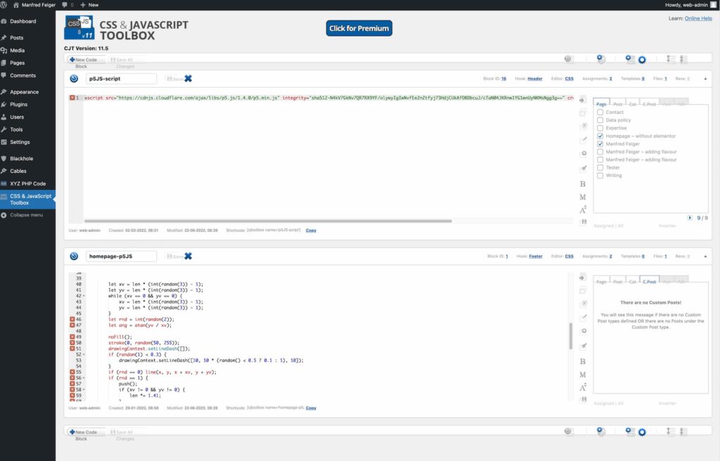
The first one at the top is loading the general p5.js script. If you also wonder, why there isn’t a minified version… yes, it sucks. There’s an alternative called q5.js. Therefore, you need to make some adjustments to the code. I haven’t had the time to give it a try, so far. But saving around 80 kb of data-weight for loading the whole library isn’t a bad saving! Especially if you think about stepping into digital sustainability.
The second one is the script I am using to generate the background image. It’s always a new image for each visitor. You are also able to define the position, where the script should be loaded, and on which pages it should be loaded. In Elementor you get features like this boxed in the pro version of it. For WordPress Core, you need this enhancement.
You could also use the tool to assign certain CSS styles to certain pages. Also, a comfortable feature, if you want to save data weight and optimize each page to the real usage of elements.
To get the code going, I also added some other things. In the editor I needed a container for the canvas object and in the styles, I added some style settings to give it a size.
After setting it up, you get this result:

With some more tweaks in terms of spacing, we got the desired result:

Resume WordPress 6 and the question of speed
In many disciplines, there are haters and critics. So, with every WordPress Update getting closer to WordPress 6, more and more users complained about the new Gutenberg editor. Also, I complained a lot, especially, getting used to editing styles in the JSON. To a huge extend this is a learning process.
Same applies to the discussions about page builders in general. Whether it be wixx, webflow or any WordPress specific builder, such as Beaver, Divi, Elementor, Fusion Builder or Oxy (at least the only once I worked with). Everyone reflects on own experiences and gives a recommendation. Unfortunately, today, we get pushed in search engines for more expressiveness, see also the recommendations of search tools.
One of the biggest points for criticism on page builders is page speed. To give you a quick glimpse, comparing my current implementation on WP 6 Core and Elementor on the live site, we see the following in lighthouse (for Desktop):


For mobile my real site outperformed my test site by some points. Even I was surprised, but I must add, that for the new site, some elements were still missing (such as indieweb support, a progressive web app and the blue circle animation on the homepage). But also, the real site got some additional tweaking’s with caching and stuff. Doing tweaking on the new site will lead to a better result (a quick check with wpfastest cache boosted the mobile ranking by 14 points up). But still, as I wrote in my article on digital sustainability… it depends on the overall effort and energy being used during the creation of the project.
Anyway, we mostly live in a world of assumptions. Also, for a website the best solution depends. Though being able to reproduce my result in Core feels great and I tend to change my live site to WordPress Core soon, I can’t recommend it for a site like this.
in terms of a client website using more advanced features, such as more JS, more popups, more interactivity, or animation, I would recommend building it in a builder. I already wrote my wish… it’s connecting the builder to the core directly, so the export is not too DOM heavy in the case of elementor (and divi). I also mentioned that I think the best builder is Oxy. Unfortunately, I only build one website in oxy so far and far more than 30 in elementor. And till now 3 in WordPress 6 Core.
For basic websites without much interactivity, multimedia features, I would recommend WordPress 6 core. There’s no money needed for plugins. Or if you have a simple site and want a more intuitive Editor, go and build the header and footer in core and leave the content for the free elementor plugin. This is also fine. Really depends on the site you are going to build. Be open to any solution and use the one that is best.
For writing my posts I use the core since the start. For lay outing the pages, I used the builder.
Additional resources:
Here are some recommended sources to keep you going:
- Full Site Editing for theme developers
- WordPress courses site
- Block Editor handbook
- Theme handbook
- Overview of what’s new to WordPress 6